Color Theory for Quilters - Tints

Before I commence with the second article in the series, I have some very good news. Ken Haines from The Color Wheel Company, in Philomath Oregon has given me permission to use his color wheel in this series of articles on Color Theory for Quilters.
I spent a great deal of time researching the plethora of color wheels available on the market at present and decided on this particular wheel. I have written my lessons to this wheel and it’s the only wheel I use when delivering my classes.
I use the Color Wheel that is published by the Color Wheel company because it reflects best the information that is required by quilters to easily understand how to use color in our quilting. I include here pictures of both sides of the color wheel that I use. I would recommend you acquire a wheel to assist with this series of articles. I have put a link at the bottom of this article on where you can obtain the color wheel that I recommend. I need also to mention here that I have not been given any complementary products from The Color Wheel Company, or benefited in any way by my recommendations.
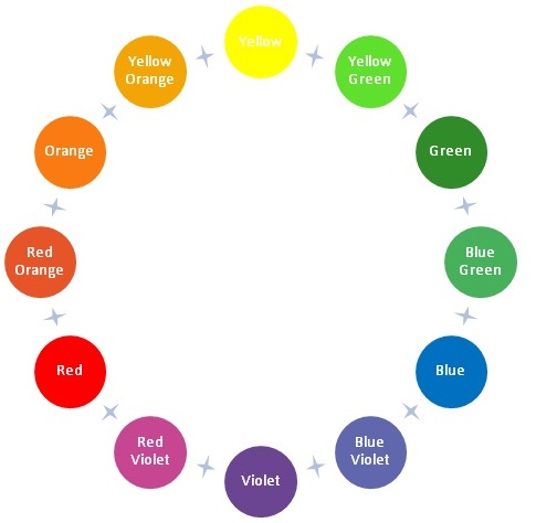
In the first article of this series on Creative Color for Quilters, we talked about how to begin to read the Color Wheel. We recognised the 12 pure colors on the wheel and how they are positioned on the wheel. We also discussed the relationship between each of these colors. If you would like to refresh your memory Click Here
Now, let’s explore the first of the three variations of the 12 pure colors. The Tints.
Here’s a horizontal visual view of the 12 pure colors and their names and their places on the wheel.

The first variation of the pure colors are the TINTS. Put simply, Tints are pure colors with white added to them to make them lighter. The most common tints that quilters use are the pastels.
In your mind imagine a paint pallette that is loaded with white. Take the pure color of yellow. What do you think will happen if you add white to the yellow? The color that we know as Lemon will be made!
PROBLEM: In the world of color as we know it, there are probably many hundred different names for the color lemon, and this creates a problem for us when we try to identify colors.
SOLUTION: To be able to identify color variations easily, we refer to the variation of Pure Yellow as Yellow Tint.
So let’s look at what happens to each of the 12 pure colors, when white is added, and they become tints.
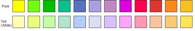
Some colors simply become lighter versions of themselves, and other colors change to almost new colours. But it is important to remember that each of the pure colours, when tinted, become pastels.
Interestingly, the most common co-ordinating colour that goes with these pastels is white, because white is contained in all the tints. In your mind’s eye, imagine a pretty little pastel baby quilt with pretty lemons, soft blues, peppermint greens and soft pinks. You wouldn’t add black or grey to this quilt, but you would add white. This is because white is contained in all the tint colours.
That concludes this article on one of the variations of pure colors – the tints. The next article will explore the second variation of pure colors – the tones.
The Color Wheel Company Website
I spent a great deal of time researching the plethora of color wheels available on the market at present and decided on this particular wheel. I have written my lessons to this wheel and it’s the only wheel I use when delivering my classes.
I use the Color Wheel that is published by the Color Wheel company because it reflects best the information that is required by quilters to easily understand how to use color in our quilting. I include here pictures of both sides of the color wheel that I use. I would recommend you acquire a wheel to assist with this series of articles. I have put a link at the bottom of this article on where you can obtain the color wheel that I recommend. I need also to mention here that I have not been given any complementary products from The Color Wheel Company, or benefited in any way by my recommendations.
In the first article of this series on Creative Color for Quilters, we talked about how to begin to read the Color Wheel. We recognised the 12 pure colors on the wheel and how they are positioned on the wheel. We also discussed the relationship between each of these colors. If you would like to refresh your memory Click Here
Now, let’s explore the first of the three variations of the 12 pure colors. The Tints.
Here’s a horizontal visual view of the 12 pure colors and their names and their places on the wheel.
The first variation of the pure colors are the TINTS. Put simply, Tints are pure colors with white added to them to make them lighter. The most common tints that quilters use are the pastels.
In your mind imagine a paint pallette that is loaded with white. Take the pure color of yellow. What do you think will happen if you add white to the yellow? The color that we know as Lemon will be made!
PROBLEM: In the world of color as we know it, there are probably many hundred different names for the color lemon, and this creates a problem for us when we try to identify colors.
SOLUTION: To be able to identify color variations easily, we refer to the variation of Pure Yellow as Yellow Tint.
So let’s look at what happens to each of the 12 pure colors, when white is added, and they become tints.
Some colors simply become lighter versions of themselves, and other colors change to almost new colours. But it is important to remember that each of the pure colours, when tinted, become pastels.
Interestingly, the most common co-ordinating colour that goes with these pastels is white, because white is contained in all the tints. In your mind’s eye, imagine a pretty little pastel baby quilt with pretty lemons, soft blues, peppermint greens and soft pinks. You wouldn’t add black or grey to this quilt, but you would add white. This is because white is contained in all the tint colours.
That concludes this article on one of the variations of pure colors – the tints. The next article will explore the second variation of pure colors – the tones.
The Color Wheel Company Website
You Should Also Read:
First Article of Color Theory for Quilters

Related Articles
Editor's Picks Articles
Top Ten Articles
Previous Features
Site Map
Content copyright © 2023 by Judie Bellingham. All rights reserved.
This content was written by Judie Bellingham. If you wish to use this content in any manner, you need written permission. Contact Judie Bellingham for details.