Review Layout Design Theory Create Strong Designs
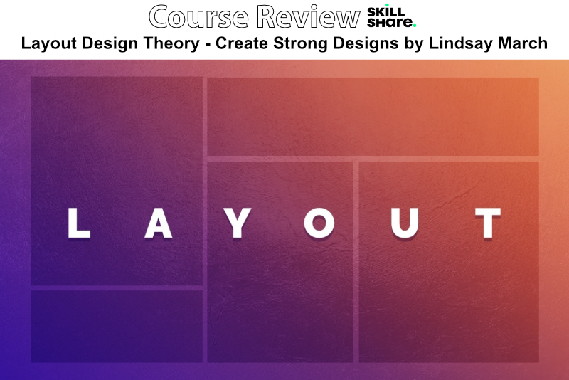
In this course, entitled Layout Design Theory - Create Strong Designs, Lindsay Marsh explores the best practices for building strong and unifying layouts. She shares her process for using a grid system to block out each design element. She covers several examples, including editorial and UX design.
Marsh begins with the broad topic of layout and design. She discusses priority of design elements and the use of white space. She discusses how to fix a poor design for a music concert poster, using good composition and a balance of photos, text and other design elements.
What makes a good and effective design layout is the next topic. Marsh believes that studying poor design is the best way to learn. She covers some examples of bad design and how to fix each example. Using Canva online, she demonstrates how to remove unnecessary design elements and organize others to build a focal point.
Next, Marsh introduces her viewers to grids and how they can be used as guides for designers. She demonstrates her process for using grids for blocking content in to a consistent and even layout. She discusses the Golden Ratio and how it can be used in several ways to create interesting layouts.
In the next lesson, Marsh introduces her downloadable PDF, The Grid Guide. She begins by covering the basic anatomy, or parts, of a design grid. She discusses the purpose of each part of the grid. She also covers the various types of grids and the purpose for each. Once that is covered, she discusses several examples of how she uses grids.
Design themes is the next topic and Marsh discusses how to create a unifying theme for a multiple page design. She discusses an example of a trifold design and how the designer used color and other design elements to create a consistent style.
Marsh next discusses an editorial design layout. She moves in to InDesign to demonstrate how to balance photos, text and other design elements in a two panel spread example. In a second example, she discusses the choice of fonts and the placement of headlines. She also covers design details such as drop caps and how to use a color from the main photo for the headline text color.
The last lessen covers UX design. Marsh discusses the use of text and color to draw the reader through the design and to the call to action. She also discusses how to block out text on the webpage and the use of the Golden Ratio.
Finally, Marsh discusses the course project and several other courses that she has on Skillshare. You will find the downloadable PDF to be a good reference for using design grids.
Marsh has been a freelance designer for over twelve years. She has extensive experience in both digital and print.
Layout Design Theory - Create Strong Designs by Lindsay Marsh affiliate link
Disclosure: As a participant in the Skillshare affiliate program, some of the links in this article are affiliate links. However, my opinions are completely my own based on my experience.
Screenshots used by permission of Skillshare .

Related Articles
Editor's Picks Articles
Top Ten Articles
Previous Features
Site Map
Content copyright © 2023 by Diane Cipollo. All rights reserved.
This content was written by Diane Cipollo. If you wish to use this content in any manner, you need written permission. Contact Diane Cipollo for details.