Designing a Web Ad : Choosing the Text
If you come from the land of newspapers, you might think that an ideal ad is chock full of text. You could dream of filling your ad space with lots of little words for the reader to slog through. That type of ad might have worked fine in newspapers - but it is a death knell for a web ad. An ad cannot be a tome the reader has to absorb before they take a further step. An ad must be a teaser - something that attracts the user's attention. The ad's sole purpose is to entice the reader to click and learn more. Then you can fill your website with the more in depth content to educate your visitor!
Example 1 - Hag Jewels
Here's an example from one of our BellaOnline advertisers, Hag Jewels -
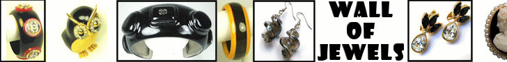
Hag Jewels does their ad perfectly here. The allure is the gorgeous jewelry. The user's eye is caught by the jewelry. The only other thing the user needs to know at this point is the product line - Wall of Jewels. Why? It's unlikely the user has heard of this site, so why bother to mention the name?
The answer is in the nature of marketing. A key aim of any marketing effort is not to directly - at that very second - get the user to consume the product! It is about building brand recognition. Numerous studies show that users won't be comfortable with growing a relationship with a brand the very first time they see it. They need a few exposures before they are willing to cross that emotional hurdle and start taking action.
An example would be a new diner on a corner. Few people would be likely, the very first time they saw it open, to stop in and order a dinner. However, they'd make a mental note of its name and what it looked like. Did it look clean? Dirty? Welcoming? They start to associate the name with that mental image. After a few times of seeing the diner on various jaunts around town, it starts to become a "known entity" in their mind. Now if someone says "where should we eat tonight?" the person might be likely to say "Hey, let's give that new diner a try and see what it's like." However, the build up to that point takes time.
The same is exactly true on the web. Web users are generally unlikely to click on an ad the very first time they see it. Sure, a tiny percentage might, but most web visitors will not click. It is only after the second or third viewing of the ad that the user will overcome that 'internal inertia' and be willing to click. So a great part of what your ad is doing during that time period is building up your brand recognition. The question is - what impression are you giving?
You need the name of your product or company to be big enough to see at a glance. The user isn't going to study your ad as if they are taking a final exam on it. They are glancing at it. The words need to be in a crisp font - nothing complicated that requires "deciphering". The words used need to be as memorable as they can be.
On the other hand, you need to keep it short. Users don't study ads. They glance. The fewer words, the better. Each word must make a powerful impression, though. Each word needs to have meaning for your goal.
Also, the words cannot overwhelm the image! Remember again that readers don't get drawn in by words. They get drawn in by images. If your words are too large or too numerous, they're going to interfere with your images' ability to do their job. Everything has to be in balance.
Example 2 - ASPCA
Here's another example, from the ASPCA -
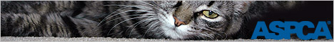
The large, sharp image is clearly the main focus here. It draws in the eye. The company name is right there, to brand the image. That is enough to get cat lovers to click to learn more.
Example 3 - Southwest Indian Foundation
Here's a skyscraper / side banner example for the Southwest Indian Foundation -

This ad is full of romantic images - the heart, the wedding vase, the heart jewelry. This would be perfect to run on the BellaOnline wedding area. The words are in support of those images, and include the word "love" to reinforce the idea. The foundation name at the bottom helps with the branding so that after a few views the user is ready to click.
Exceptions to the Word Rule
I'll note here that there are of course a few exceptions to every rule! If you are giving away something free, that attracts peoples' attention. People love free. So if you are giving away a free ebook on pet care for kids, then certainly say
FREE EBOOK!
as your main ad text. But always make sure you get the visual angle as well. Add in an image of a cute kitten and a cute puppy, one on either side. That will ensure you get the attention and the clicks!
Once you have your ideal images, and the perfect text to go with them, it's time to make sure the ad works in all situations!
Step 4: Optimizing Web Ads
Designing a Web Ad - Main Page
Custom Banner Ad Design - Only $50!
Web Statistics for Designing High Quality Ads
Browser Percentage Use
Platform / OS Percentage Use
Resolution Percentage Use
Intro |
Philosophy |
Traffic |
Rates |
How This Works |
Glossary |
Link Exchange
Sweepstakes |
Partnerships |
Media Kit |
Testimonials |
FAQ |
Sample Admin |
Contact Us |
Sign Up
|