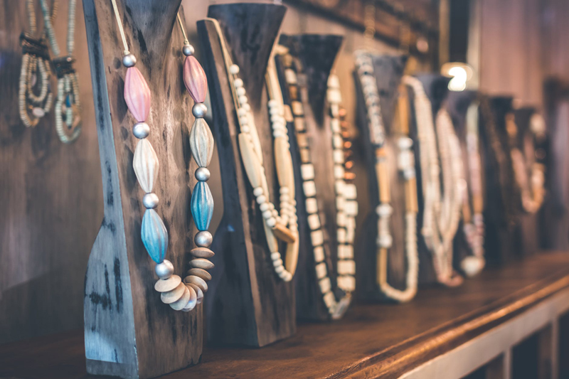
Expressing Yourself In Color -- Color Theory For Jewelry Designers
As people, we all share common fears. Say, speaking in public or an unexpected call from the IRS. But, as beaders, we have an entirely new set of fears. Maybe it’s trying a new technique. Or asking our significant other what they think of our work. But, one fear is so common, yet so simple...we are afraid of color. Something about the simple act of expressing ourselves with colors seems to intimidate many of us. For some reason, we worry that the colors won’t look right, or maybe we wonder if we are actually color-blind and our friends are just being too polite to tell us. So, time after time, we will reach for those “safe” tones. Or, perhaps we will decide that a simple palette of 2 colors will express ourselves sufficiently.
In many of my classes, I have seen this time and again. There has even been a time or two when a student has asked me to decide on her bead colors before she is willing to learn a new technique. It is here and now that I am going to share a secret beading mantra. Close your eyes and quietly repeat this chant....
“....These are only beads....”
That’s right. All the beautiful hues of the planet, trapped in a tiny, sparkling ball of glass. You can touch them, string them, weave them, even throw them into the air...and they will always remain what they are...beads. Unlike other art forms like painting, our artistic medium will never change. Once paint is released from a tube, it is usually gone forever, should we change our minds. But, we have the advantage with beads. You can decide that your choice doesn’t suit you after all, cut the thread, and you will still have beads to be used in your next project.
All you needed to learn about color, you learned in grade school....
It is true. The basis of all color can be found in those little boxes of crayons that we loved as children. Let’s review the basics, shall we?
Primary Colors: You remember this one, don’t you? That basic triangle with the 3 primary colors: red, blue and yellow. Take those colors out of your imaginary crayon box. See how they are bright and clear? These are color in the purest sense of the word.
Secondary Colors: Now, think about the points between each corner of that triangle. The point between blue and red. Mix these 2 colors together and you will get purple. Red and yellow make orange. Yellow plus blue makes green. So, take these colors out of your crayon box. See the surprise? Continue on down to....
Tones: There is more than just one green, isn’t there? Brilliant emerald. The green of a new leaf. Frosty mint julip. This is when people start to get a little intimidated. But, it is simple to grasp. All these colors are green...they just have a little more blue or yellow to them than the next color. Sometimes a tiny dash of an unexpected tone can add interest...like a dash of grey can make a green turn into “sage”.
“ You’re getting warmer......”
Now, we are off to the next level of the wonderful world of color! There is a couple of important things to know when you are looking though your stash of beads and wondering what colors to chose.
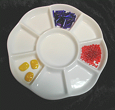
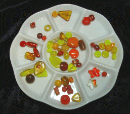
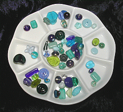
Warm colors vs cool colors: Yes, colors actually have a temperature! Warm colors are based on red / orange / yellow tones. When you think of warm colors think of hot cinnamon candies. A blazing sunset. A warm terra cotta planter full of orange and red geraniums. Cool colors are based on the green / blue / purple tones. Think opposite of warm! The color of the ocean on a stormy day. A walk though a shady forest. Icy blue and mauve. One important thing to remember is each color can have cool and warm characteristics. Tomato red will be warmer than a cool wine red. Unless your design calls for a warm / cool combination; try to keep your color palette on one side or the other.
Contrast vs Complementary: Colors have close family ties...but opposites also attract. This is where you can really make your colors “pop”. Complementary colors are the exact opposite from each other. On a color wheel, this means they will be on opposite sides. Think of pink tulips on a light green stem. Colors in the same family also will work together beautifully. Picture a rich symphony of blue, violet and deep purple beads.
Creative color and beadwork:
There are only a few rules to be followed when you combine color and beadwork One rule is “you only need to please yourself “. That is right! The best color combinations are the ones that make you feel good. Another rule is to give yourself the permission to play and experiment. Put your hanks of seed beads next to each other. Look at a special focal bead and allow yourself to focus on the colors within. Sometimes this is easier if you step away from your beads a few feet and pay attention to the first colors that catch your eye.
Proper lighting is not only important...it is critical. The best light is natural daylight. Go to the store and buy a natural daylight bulb to put into your work lamp. Or, better yet, invest in a special natural light work lamp, like an Ott-Lite. These can be expensive...but your eyes will thank you later. Another trick is to keep your background neutral as you look at your colors. A warm background can wash out the true tones of cool colors and make color identification near impossible. Try putting down a white surface, like a towel, to help you see the true color.
Sometimes, a little help is in order. If you need to actually see a color in front of you to visualize it, color swatches may be the answer. Go down to your local home improvement store and select a number of paint sample cards. These can be cut apart and you can experiment with different color combinations. Another place to look would be an art supply store. Invest in a color wheel or even an artists’ textbook guide to color. In the long run, it came be a great help.
You should be aware that color is around us at all times. Sometimes, inspiration can hit at the most unlikely sources. Maybe it’s the new high fashion hues from the fashion world. Perhaps it’s the color theme in your favorite romantic restaurant. It can even be that wild splash of color from a riotous bouquet of flowers. Always be open-eyed to the colors around you.
Color as a technique
The last thing that I would like to cover is using color as a means of beading technique. Colors can both “pop” out of a piece, or slowly slide through. It’s up to you how you want to use it.
Often you will come across beads that are close in color...but ever-so-slightly different. Like color on a sliding scale, there is a slight change. One may be a hint darker or lighter, another slightly a different tone....just a subtle difference. If you want the color of your beadwork to stand out, you should avoid using these like colors so close to each other, as they will “fade” into each other. The differences will disappear and the colors will fade into just one color that is visible to your eye. For the best results, make certain that there is enough of a contrast to keep your colors high-impact. (Think along the lines of a light strawberry pink with a darker raspberry)
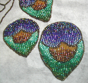
But, there is another technique that actually requires these subtle changes. This is known as “bead painting”. There are times when beads can be used as you would use paint. You can literally design “pictures” within your work, or you can add a gentle shading or highlight. The key to this technique is to carefully “blend” your beads as you would blend paint with a brush. Start out with one color. Slowly “add” another color, by carefully mixing the areas in between by adding more or less of your new and old colors. In seed beads, this can be achieved by starting out with one color, then adding 1 bead of the new color, adding 6 beads of the old color, than adding 2 beads of the new, and so on. This can give you amazing depth and character to a piece of beadwork.
I hope that I have inspired you to go pour your beads into little piles of color and go wild with creativity. Trust your instincts. You are after all, an artist, with the amazing medium: beads. Enjoy!
About The Author: Kimberly Allison is the owner of Lume di Luna Designs. She teaches and creates artisan jewelry and beaded dolls. Her work has been featured in galleries as well as juried shows. You can reach Kimberly at LumediLunaDesign@aol.com.
In many of my classes, I have seen this time and again. There has even been a time or two when a student has asked me to decide on her bead colors before she is willing to learn a new technique. It is here and now that I am going to share a secret beading mantra. Close your eyes and quietly repeat this chant....
“....These are only beads....”
That’s right. All the beautiful hues of the planet, trapped in a tiny, sparkling ball of glass. You can touch them, string them, weave them, even throw them into the air...and they will always remain what they are...beads. Unlike other art forms like painting, our artistic medium will never change. Once paint is released from a tube, it is usually gone forever, should we change our minds. But, we have the advantage with beads. You can decide that your choice doesn’t suit you after all, cut the thread, and you will still have beads to be used in your next project.
All you needed to learn about color, you learned in grade school....
It is true. The basis of all color can be found in those little boxes of crayons that we loved as children. Let’s review the basics, shall we?
Primary Colors: You remember this one, don’t you? That basic triangle with the 3 primary colors: red, blue and yellow. Take those colors out of your imaginary crayon box. See how they are bright and clear? These are color in the purest sense of the word.
Secondary Colors: Now, think about the points between each corner of that triangle. The point between blue and red. Mix these 2 colors together and you will get purple. Red and yellow make orange. Yellow plus blue makes green. So, take these colors out of your crayon box. See the surprise? Continue on down to....
Tones: There is more than just one green, isn’t there? Brilliant emerald. The green of a new leaf. Frosty mint julip. This is when people start to get a little intimidated. But, it is simple to grasp. All these colors are green...they just have a little more blue or yellow to them than the next color. Sometimes a tiny dash of an unexpected tone can add interest...like a dash of grey can make a green turn into “sage”.
“ You’re getting warmer......”
Now, we are off to the next level of the wonderful world of color! There is a couple of important things to know when you are looking though your stash of beads and wondering what colors to chose.
Warm colors vs cool colors: Yes, colors actually have a temperature! Warm colors are based on red / orange / yellow tones. When you think of warm colors think of hot cinnamon candies. A blazing sunset. A warm terra cotta planter full of orange and red geraniums. Cool colors are based on the green / blue / purple tones. Think opposite of warm! The color of the ocean on a stormy day. A walk though a shady forest. Icy blue and mauve. One important thing to remember is each color can have cool and warm characteristics. Tomato red will be warmer than a cool wine red. Unless your design calls for a warm / cool combination; try to keep your color palette on one side or the other.
Contrast vs Complementary: Colors have close family ties...but opposites also attract. This is where you can really make your colors “pop”. Complementary colors are the exact opposite from each other. On a color wheel, this means they will be on opposite sides. Think of pink tulips on a light green stem. Colors in the same family also will work together beautifully. Picture a rich symphony of blue, violet and deep purple beads.
Creative color and beadwork:
There are only a few rules to be followed when you combine color and beadwork One rule is “you only need to please yourself “. That is right! The best color combinations are the ones that make you feel good. Another rule is to give yourself the permission to play and experiment. Put your hanks of seed beads next to each other. Look at a special focal bead and allow yourself to focus on the colors within. Sometimes this is easier if you step away from your beads a few feet and pay attention to the first colors that catch your eye.
Proper lighting is not only important...it is critical. The best light is natural daylight. Go to the store and buy a natural daylight bulb to put into your work lamp. Or, better yet, invest in a special natural light work lamp, like an Ott-Lite. These can be expensive...but your eyes will thank you later. Another trick is to keep your background neutral as you look at your colors. A warm background can wash out the true tones of cool colors and make color identification near impossible. Try putting down a white surface, like a towel, to help you see the true color.
Sometimes, a little help is in order. If you need to actually see a color in front of you to visualize it, color swatches may be the answer. Go down to your local home improvement store and select a number of paint sample cards. These can be cut apart and you can experiment with different color combinations. Another place to look would be an art supply store. Invest in a color wheel or even an artists’ textbook guide to color. In the long run, it came be a great help.
You should be aware that color is around us at all times. Sometimes, inspiration can hit at the most unlikely sources. Maybe it’s the new high fashion hues from the fashion world. Perhaps it’s the color theme in your favorite romantic restaurant. It can even be that wild splash of color from a riotous bouquet of flowers. Always be open-eyed to the colors around you.
Color as a technique
The last thing that I would like to cover is using color as a means of beading technique. Colors can both “pop” out of a piece, or slowly slide through. It’s up to you how you want to use it.
Often you will come across beads that are close in color...but ever-so-slightly different. Like color on a sliding scale, there is a slight change. One may be a hint darker or lighter, another slightly a different tone....just a subtle difference. If you want the color of your beadwork to stand out, you should avoid using these like colors so close to each other, as they will “fade” into each other. The differences will disappear and the colors will fade into just one color that is visible to your eye. For the best results, make certain that there is enough of a contrast to keep your colors high-impact. (Think along the lines of a light strawberry pink with a darker raspberry)
But, there is another technique that actually requires these subtle changes. This is known as “bead painting”. There are times when beads can be used as you would use paint. You can literally design “pictures” within your work, or you can add a gentle shading or highlight. The key to this technique is to carefully “blend” your beads as you would blend paint with a brush. Start out with one color. Slowly “add” another color, by carefully mixing the areas in between by adding more or less of your new and old colors. In seed beads, this can be achieved by starting out with one color, then adding 1 bead of the new color, adding 6 beads of the old color, than adding 2 beads of the new, and so on. This can give you amazing depth and character to a piece of beadwork.
I hope that I have inspired you to go pour your beads into little piles of color and go wild with creativity. Trust your instincts. You are after all, an artist, with the amazing medium: beads. Enjoy!
About The Author: Kimberly Allison is the owner of Lume di Luna Designs. She teaches and creates artisan jewelry and beaded dolls. Her work has been featured in galleries as well as juried shows. You can reach Kimberly at LumediLunaDesign@aol.com.

Editor's Picks Articles
Top Ten Articles
Previous Features
Site Map
Content copyright © 2023 by Kimberly Allison. All rights reserved.
This content was written by Kimberly Allison. If you wish to use this content in any manner, you need written permission. Contact Susan Mendenhall for details.