Designing a Web Ad : Choosing the Graphics
Once you have evaluated the target audience for one of your ads, the next step is to create an ad which taps into that target audience's personal interests. Again, it is important to make sure your target is as small as possible, so that you can make your ad as directed at them as possible. Your ad should NOT seem to be an ad! People are bombarded with ads in modern times, on TV, on billboards, in elevators, and on webpages. They tune them out automatically. Your "ad" needs to be seen as a helpful and interesting item. The first way to catch their attention is with a graphic that appeals to their interest.
For example, if someone adores cats, and they see a photo of an adorable kitten out of the corner of their eye, you know they're going to look. They don't care if it's an ad or not, they simply like kitten photos.
Warning:
I want to caveat here that you should never use flashing or jiggling ads. First, viewers find these wildly obnoxious, and move off the page immediately without even bothering to see what the ad was for. More importantly, flashing / jiggly ads can cause medical issues and therefore liabilities for you as the ad creator. Avoid at all cost.
Even rotating ads should be avoided. People don't sit and stare at ads and wait to see what happens. You are lucky if they see the ad. You want to make sure that what is shown is absolutely your very best effort, and that it sits there long enough to be noticed, paid attention to and acted on. You need one static image that is powerful.
So that being said, what should your ad look like?
Clear Images
Your images in your ad must be clear and meaningful even at small resolution sizes, even on Macs, even on browsers you do not normally use. There are several tips for helping to ensure this:
* Use a high quality image. Don't settle for a so-so image of a cat you took in your back yard. Make sure it's the perfect cute cat image that has the very best chance of attracting the eye. Remember, web users are jaded. They glaze over when they see something even remotely "ad like". You need your image to be perfectly clear and on target.
* Use an in focus image. You would think this would be a given! Your image needs to be in focus, sharp, easily recognizeable.
* Your image must BE the focus. Remove all background clutter. Remove anything even remotely distracting. The user must see that image and instantly know what it is.
* Your image must immediately present a positive connection with the target audience. If you have a superb photo of a dog - but you're selling to cat owners - you're probably not going to get their attention. Make sure the image says exactly what you mean. Remember, a picture is worth a thousand words. That picture is going to be the thing that gets the user to even look at your ad area.
* Show multiple images if at all possible, but not too many. This is a balancing act. If you sell gorgeous jewelry, and you only show one item, what if the viewers happen not to like that piece? It could be they adore your style and would have eagerly clicked if they saw one of your other offerings. However, if you try to stuff too many images into an ad then the clutter gets to be too much and the user won't take the time or effort to review them. You should aim for 2-5 images as the amount you want to put into your ad. Each image needs to be as large as humanly possible.
Example 1 - Hag Jewels
Here's an example from one of our BellaOnline advertisers, Hag Jewels -
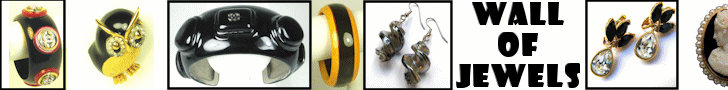
See how each image is clear and sharp, and a variety of styles is shown? Let's say that 50% of the viewers love that first ring and click immediately on the ad when they see the first ring - but the other 50% just aren't that keen on it. However, the owl appeals to another 20% of the viewers. And so on. The more discreet images you display, of different types, the more likely you are to catch someone's attention.
Even better, Hag Jewels didn't stop there. They don't run just one ad. They have multiple ads in the system. That way a person is shown different ads at different times. Maybe nothing on the first ad strikes the attention of 10% of the viewers. It happens. But then those viewers go to another BellaOnline page, see the new ad, and now something is just perfect for them! They click!
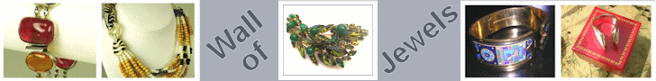
Example 2 - Southwest Indian Foundation
Here's another example, a charity that BellaOnline supports. This is the Southwest Indian Foundation -

Again, multiple images are shown, crisp, clear, easy to recognize. They catch the eye and immediately convey what the destination site is all about.
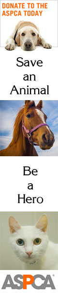
Example 3 - ASPCA
BellaOnline loves the ASPCA. This side banner ad shows how the same multiple image theory can be used very well in a side banner / skyscraper size.
So to summarize you should always have several crisp, large, clear images on your ad. Text just doesn't do the trick. Websites are full of text. Text rarely catches the eye. A well chosen set of photos will catch the eye and make sure the user's eyeball even moves over to the ad you are running, to see what it is all about.
Once you have selected the images, it is time to add some words!
Step 3: Choosing the Text
Designing a Web Ad - Main Page
Custom Banner Ad Design - Only $50!
Web Statistics for Designing High Quality Ads
Browser Percentage Use
Platform / OS Percentage Use
Resolution Percentage Use
Intro |
Philosophy |
Traffic |
Rates |
How This Works |
Glossary |
Link Exchange
Sweepstakes |
Partnerships |
Media Kit |
Testimonials |
FAQ |
Sample Admin |
Contact Us |
Sign Up
|